
Specialist print
Specialists in Tactile & Sensory Print
Bring another dimension to your brand. Explore raised patterns, selective sheen and surfaces that invite a closer look.
Start a project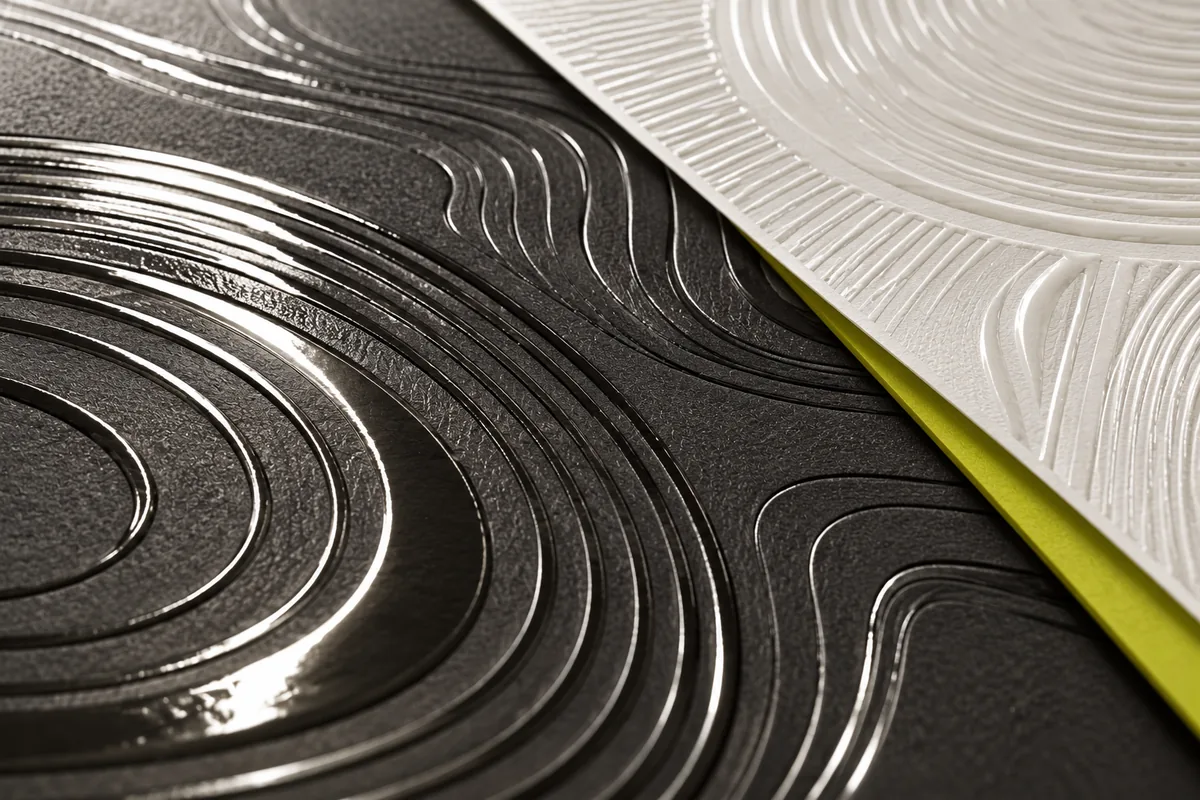
From the artwork to the way it feels.
The detail starts with your brief. We develop the texture, test the substrate and make a physical sample so you can assess the relief, colour and finish before production.
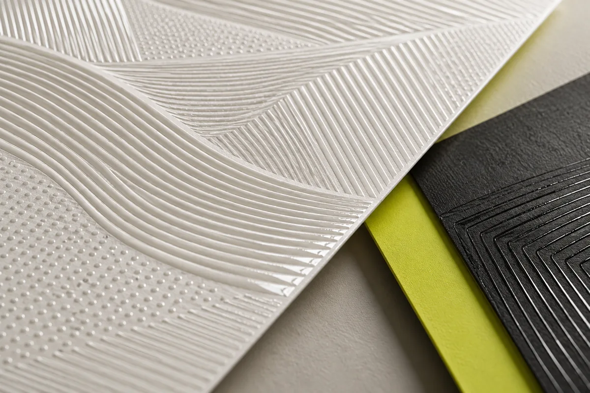
Texture with purpose.
Use pattern, raised detail and contrasts in sheen to support the character of a display or branded environment.
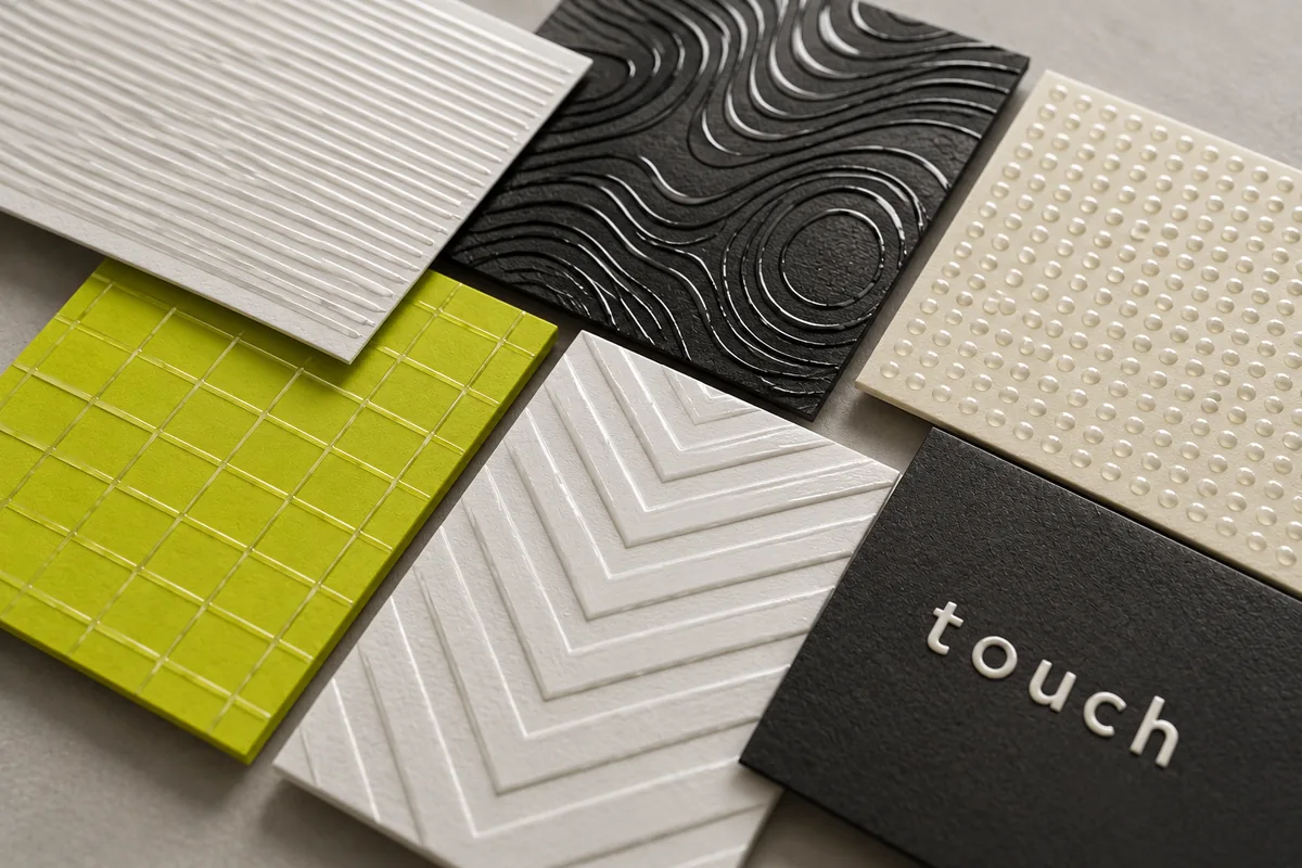
Sample it. Then specify it.
Agree the achievable effect, handling requirements and suitability for the environment against the approved physical sample.
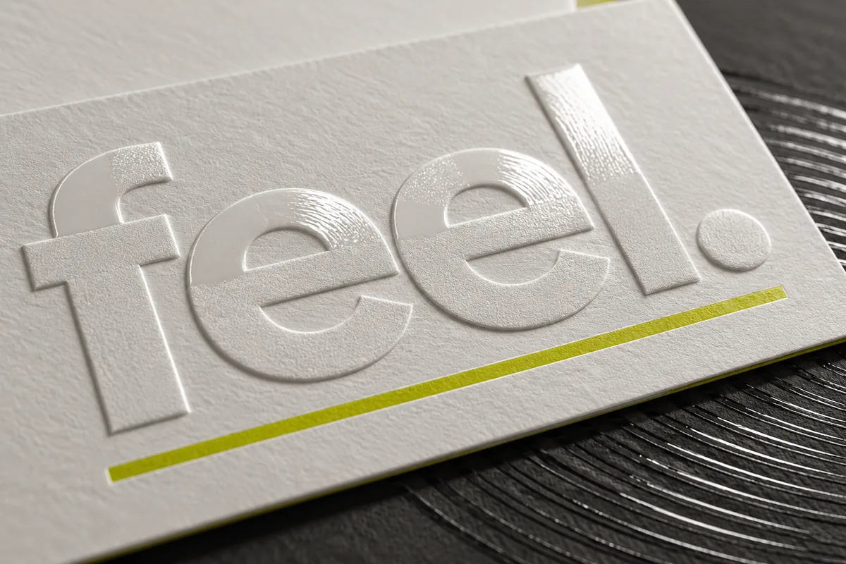
Let the lettering do more.
Raised type and selected graphic details can give a display another point of interest. We develop the artwork and material combination around your brief, then sample the intended finish.
Finishes we can explore.
Effects built into the print and the material, so the finish is part of the piece.
- Textured printRaised textures built up in the print, from a subtle grain to a stronger relief.
- Dimensional detailRaised lettering, logos and patterns that catch the light.
- Gloss and matt contrastGloss picked out against matt, or the reverse, for logos and detail.
- White inkWhite under or over colour, for dark, clear and metallic materials.
- Metallic effectsMetallic looks created with the print and the material together.
- Printing direct to materialsPrinting straight onto board, timber, acrylic and other sheet materials.
- Colour matchingBrand colours checked across the different materials in a project.
- SamplesPhysical samples of an effect on your material, to approve in the hand.
Worth thinking about early.
The material
Every material takes print differently, so we’d test on the one you intend to use.
Light and distance
Gloss, texture and metallic effects depend on the lighting and how close people get. Judge a sample where it’ll be seen, if you can.
Handling
Surfaces that are touched, cleaned or moved need a finish that can cope. Tell us how the piece will be used.
Texture and accessibility
Decorative texture isn’t the same as tactile or Braille information, which needs its own specification and checking.
Questions we’re asked.
Can we see a sample before we commit?
Yes. A finish is best judged in the hand, so we can develop samples around the effect and application you have in mind.
Which materials can you print onto?
Many sheet materials, including boards, timber and acrylic. Results vary with the surface, so if the material is unusual, send us a piece to test.
Can you match our brand colours across materials?
We can check and match colours on each material in the project. Some colours can’t be reproduced identically on every surface; where that’s the case, we’ll show you the closest match on a sample.
Is textured print suitable for accessible signage?
Not on its own. Braille, tactile maps and accessible interpretation need to be specified and checked as a requirement in their own right. Tell us if your project needs them.
Where it’s used.
Luxury, beauty & fragrance
Retail environments and product presentation where colour, texture and finish matter at every distance.
ExploreMuseums, heritage & attractions
Interpretation graphics, displays and wayfinding developed around the visitor experience.
ExploreRetail & consumer brands
Give customers a consistent brand experience, from a single display to a coordinated retail campaign.
ExploreWhat would you like people to feel?
Bring us your artwork, a material reference or an early idea. We’ll help explore a suitable production route.